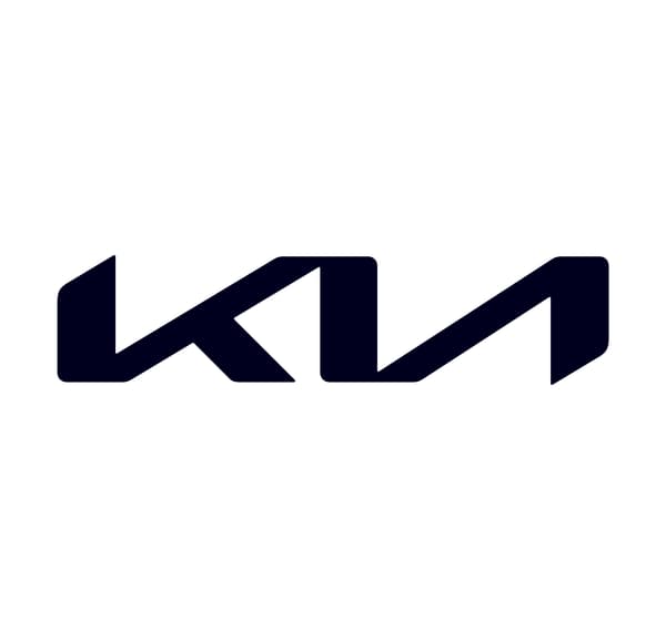
There are some logo changes that are more successful than others. If in France the new visual identities of Renault or Peugeot seem to attract the majority of the public, this is probably not the case for Kia.
A change that dates back to the beginning of 2021 for the Korean brand, with a profound modification. The red oval with the KIA name and a slashless “A” had existed since 1994, to be replaced by what was intended to be closer to a “handwritten signature”.

“The logo’s continuous, rhythmic line expresses Kia’s commitment to creating inspiring experiences, while its symmetry conveys a true sense of confidence,” a brand press release detailed at the time.
A “Kia” that says “KN”
Except that the new writing doesn’t necessarily read as easily as the old one. Witness exploding Google searches lately to find what a mysterious “KN” stands for, the letter “i” mixing with “a” to finally resemble an “N”.
According to the edgeciting a tweet from an official of a US communication agency, there are approximately 30,000 searches per month for this term “KN” since the introduction of this new logo.
Therefore, if many people seem to have trouble reading the new logo, the brand continues to build its sales around the world. In France, for example, its market share from January to October was 3.05%, 4% more year-on-year. And the brand places several of its models in the top 100 best sellers, with its Sportage, Niro and Stonic SUVs, the small Picanto city car or its 100% electric car, the EV6, chosen European car of the year in 2022.
A success that may also be at the origin of this research boom: with more and more of its latest models on the roads, more and more passers-by and other motorists may be intrigued by this “KN”.
Source: BFM TV

