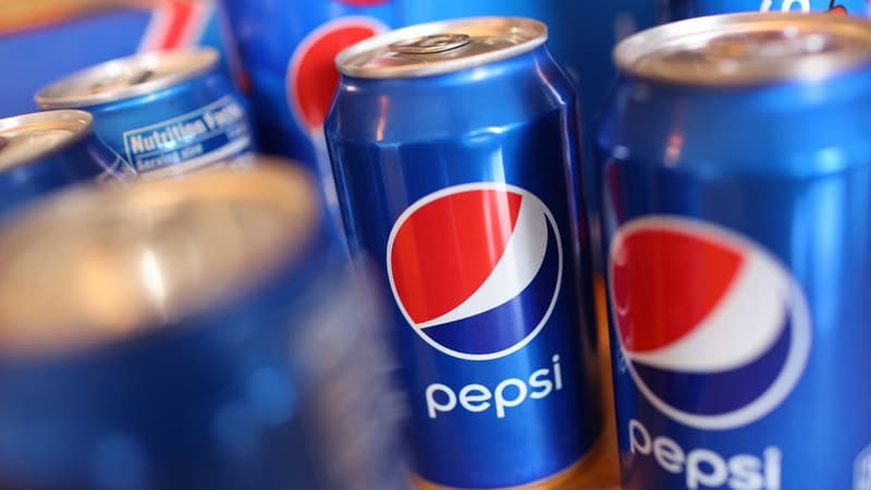
Pepsi changes its logo. The Pepsico group has unveiled a new visual identity for its famous soft drink, the great rival of Coca-Cola. The current logo, in force since 2008, gives way to a new version inspired by that of the 90s. After separating the emblematic three-color globe from the brand name, it is placed in the center again, in capital letters. This new logo will be rolled out in North America next fall and then in the rest of the world in 2024, to mark the brand’s 125th anniversary.
Drawing inspiration from its 1990s foundations and design, Pepsi relies on nostalgia not to upset its consumers. Pepsico probably has in mind the catastrophic failure of the new Tropicana logo in 2009: The visual identity of the fruit juice brand, then owned by the group, had been completely overhauled, but the change turned away consumers who did not better identify the brand. The company had been forced to back down due to the drop in sales in supermarkets.
“Zero sugars”
Pepsi, however, claims to look to the future. The brand name is now written in black and the logo is surrounded by a black border, a way of highlighting the “zero sugar” version of the soft drink, whose can is also black. In a market where very sweet sodas are no longer necessarily popular, Pepsi is refocusing its communication. The “sugar-free” version will be “the protagonist of our communication strategy”, confirms Mauro Porcini, Pepsico’s design director, to CNN.
Source: BFM TV


